Ddareungi (Seoul Bike) is a bicycle sharing service operated by the Seoul city for Seoul citizens, which has been widely used since its launch in 2015.
While the number of users are increasing, the assessment of this application is low (1.5 on the App Store in 2020). As one of the users of Ddareungi, I also sometimes felt uncomfortable with the application. Therefore, I worked on redesign to improve the UX and UI of Ddareungi application.
Side Project
Apr 2020 (2-3weeks)
Jiyoon Ko
Figma, Illustrator
Since it's launched in 2015, the number of users of Ddareungi continues to increase, but the application rating continues to drop. It inspired me to look at the app deeply.
.png)
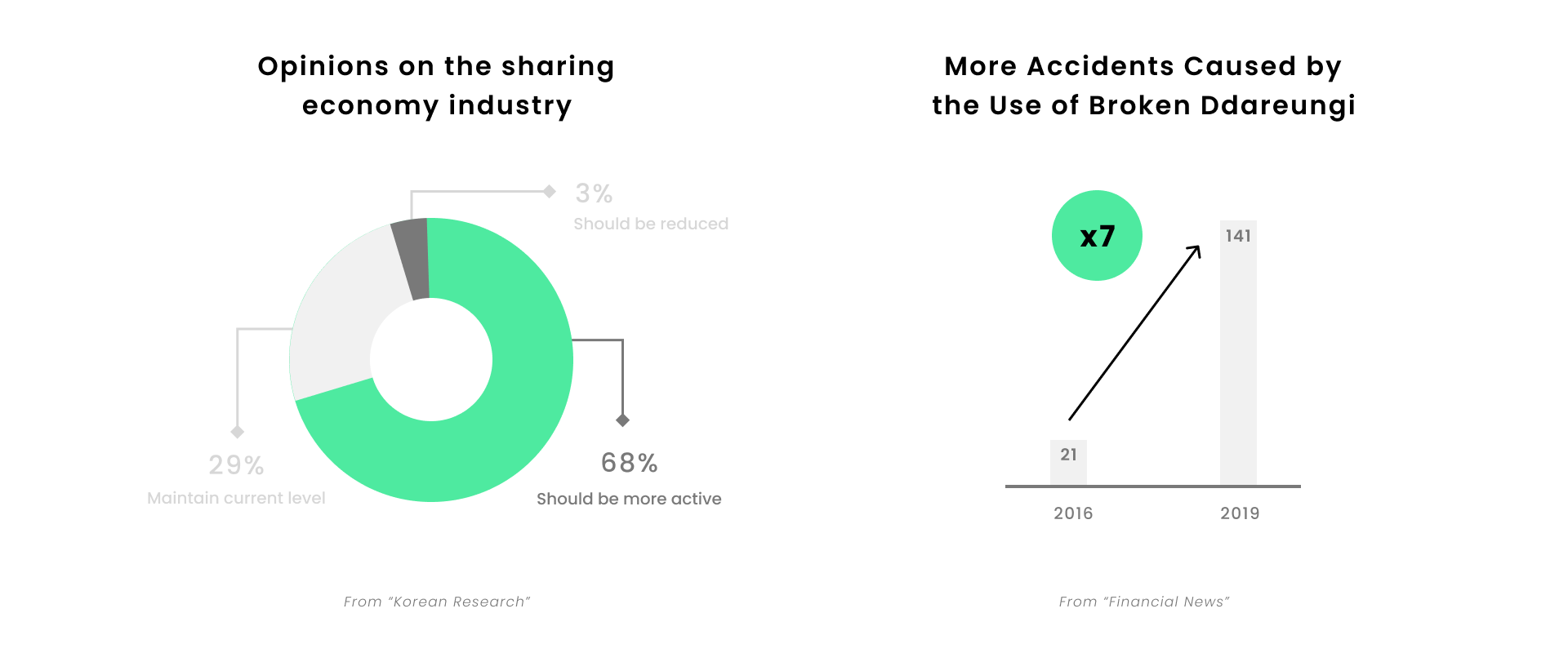
Before I jumped right into this problem, I did desk research. First, most people responded positively to the sharing economy industry. And I found the news that as the use of the Ddareungi increases, the accident of Ddareungi is increasing. Therefore, I think that the usage rate of the Ddareungi app is likely to increase gradually, and as the risk increases, the redesign of the Ddareungi app is essential.
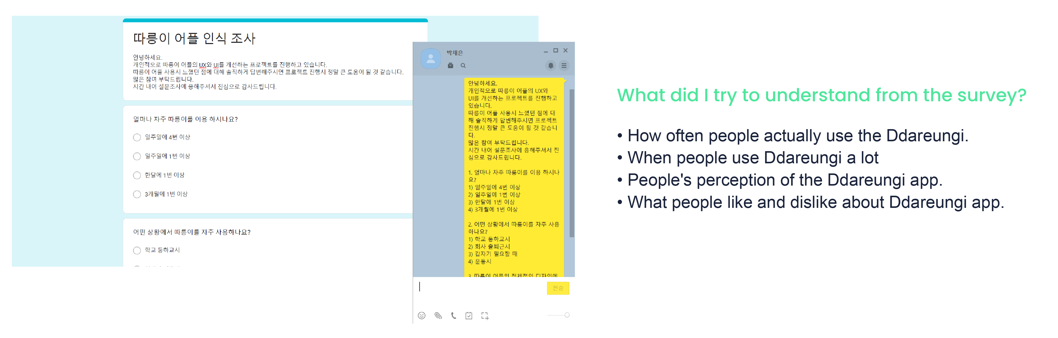
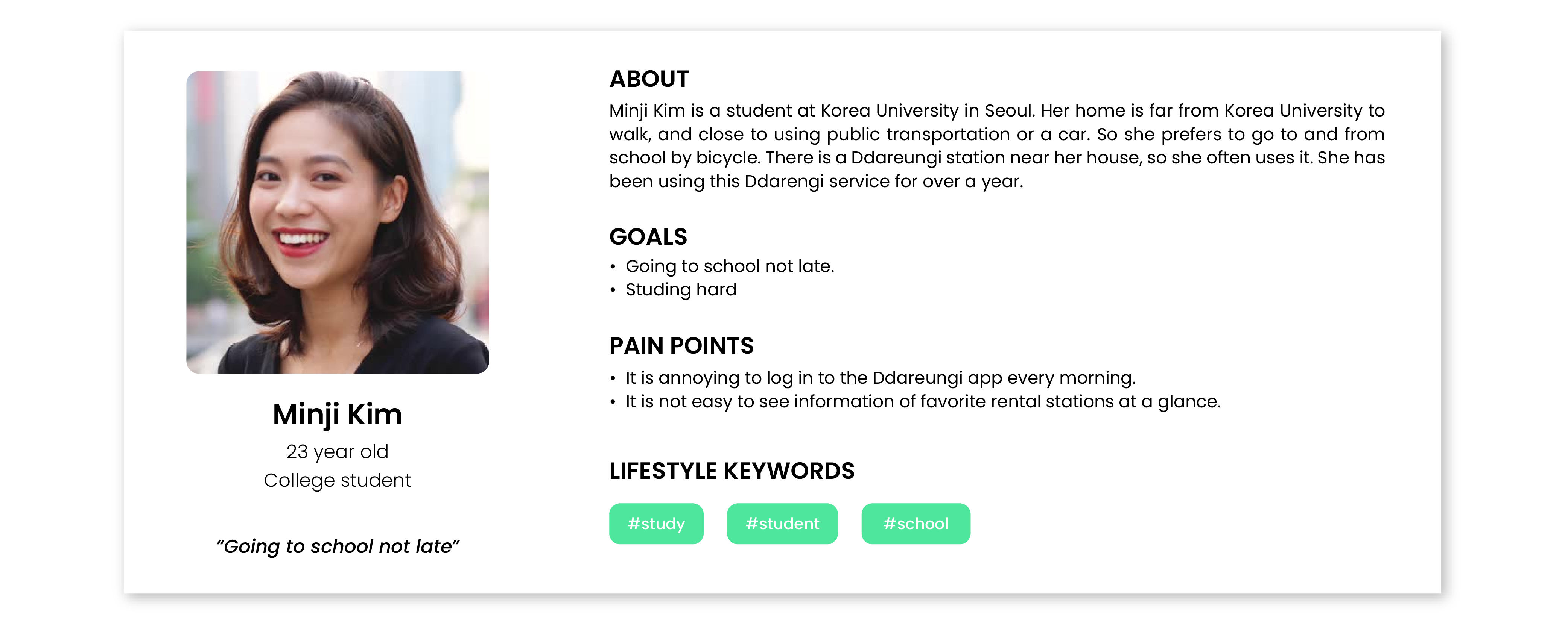
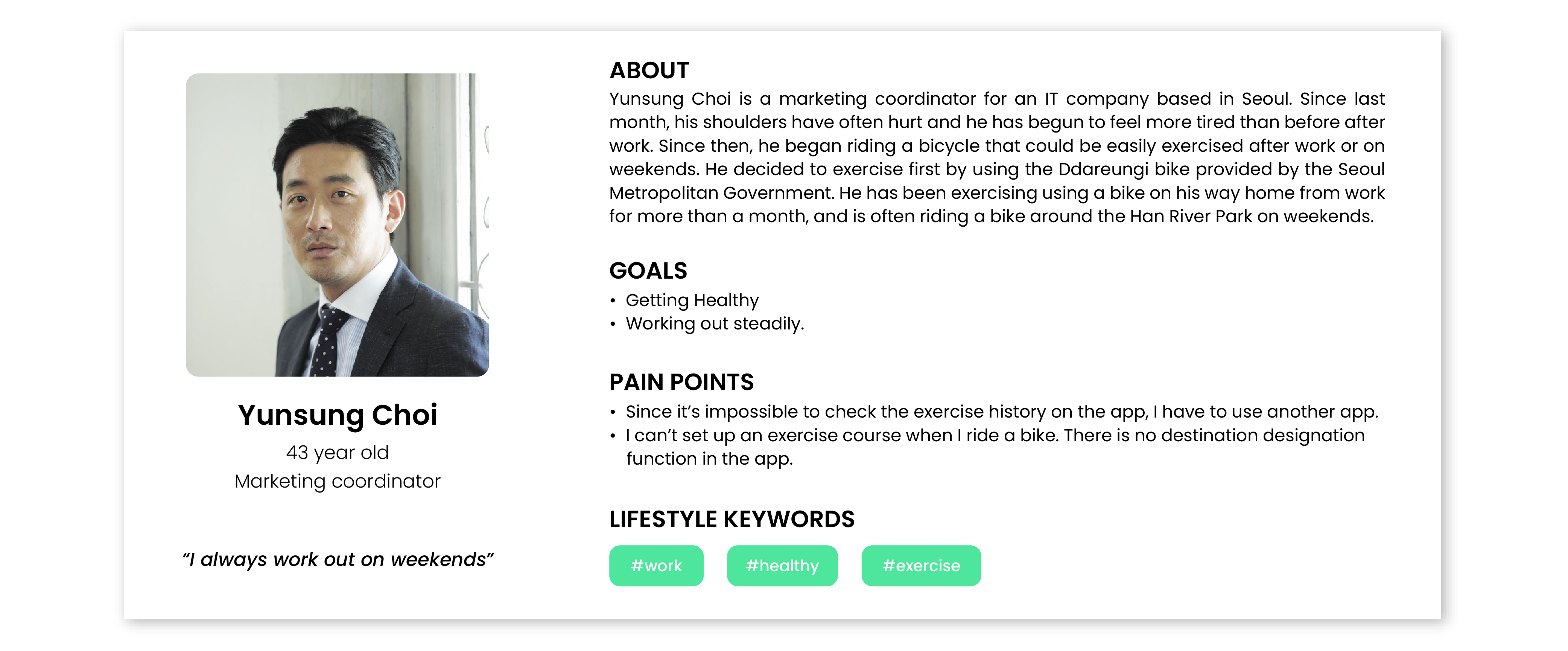
I conducted user survey to get insights from the target users. I used Google Survey and Kakaotalk. I posted this survey to my acquaintances and the online school community. I also included short-answer questions to get various opinions from diverse users.
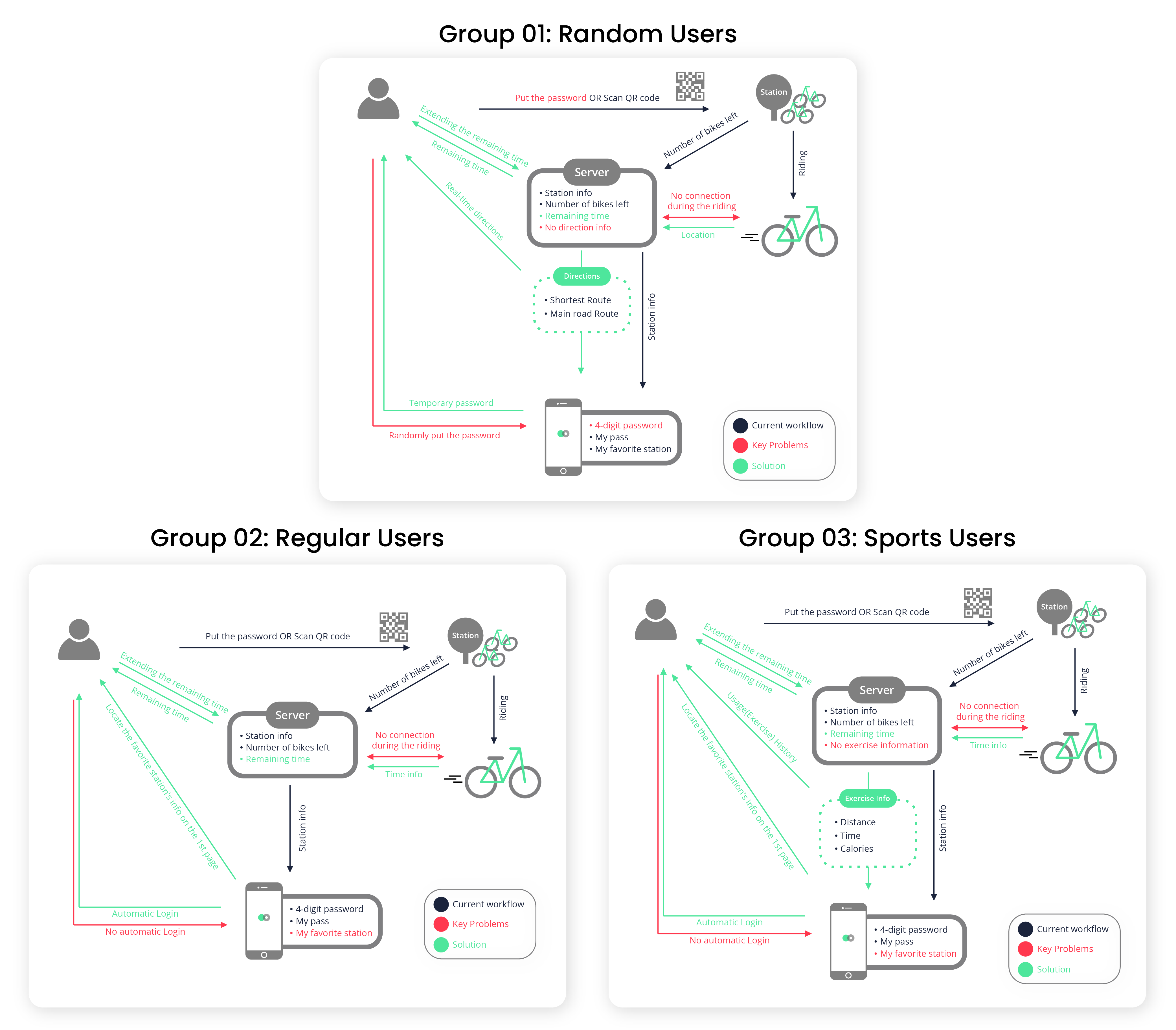
Based on the user survey, I was able to group the main targets into three groups. There is an arbitrary group of users who take bicycles for any reason, such as an emergency (Group 01: Random Users). A group of ordinary users is a group that regularly uses bicycles to commute to and from work and school(Group 02: Regular Users). A sports user group is a group that uses bicycles for sports or sports purposes(Group 03: Sports Users).
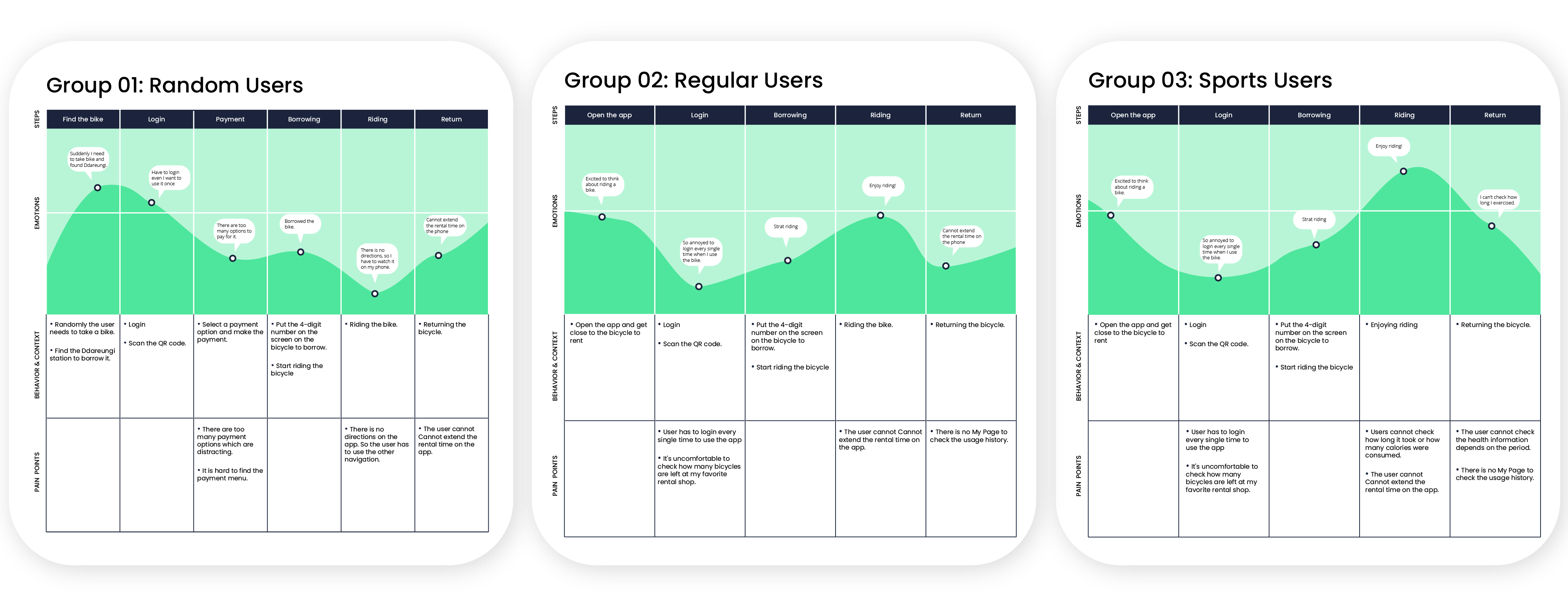
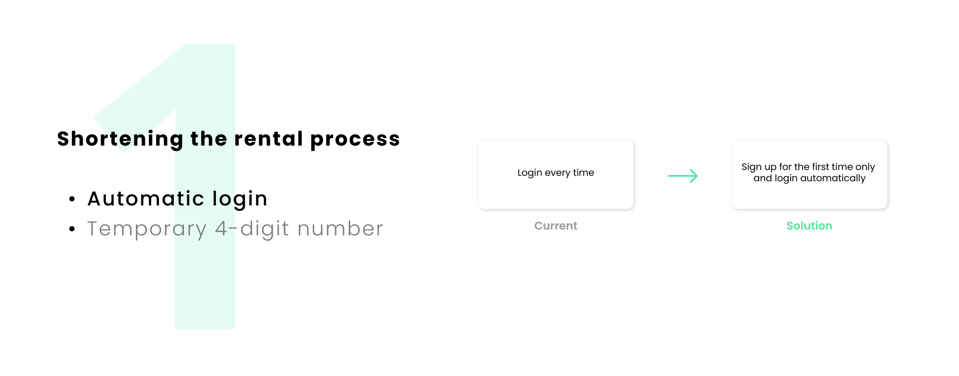
To visualize the current workflow of the app and point the pain points, I draw a flow model regarding each target group. After that, I put the possible solutions based on the key problems for each user.
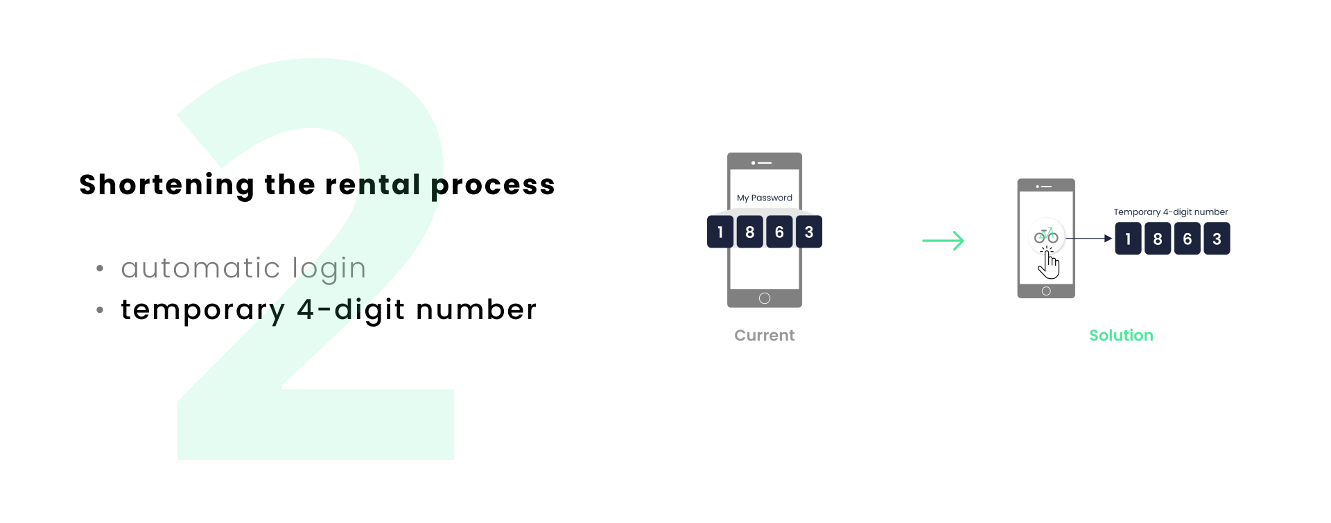
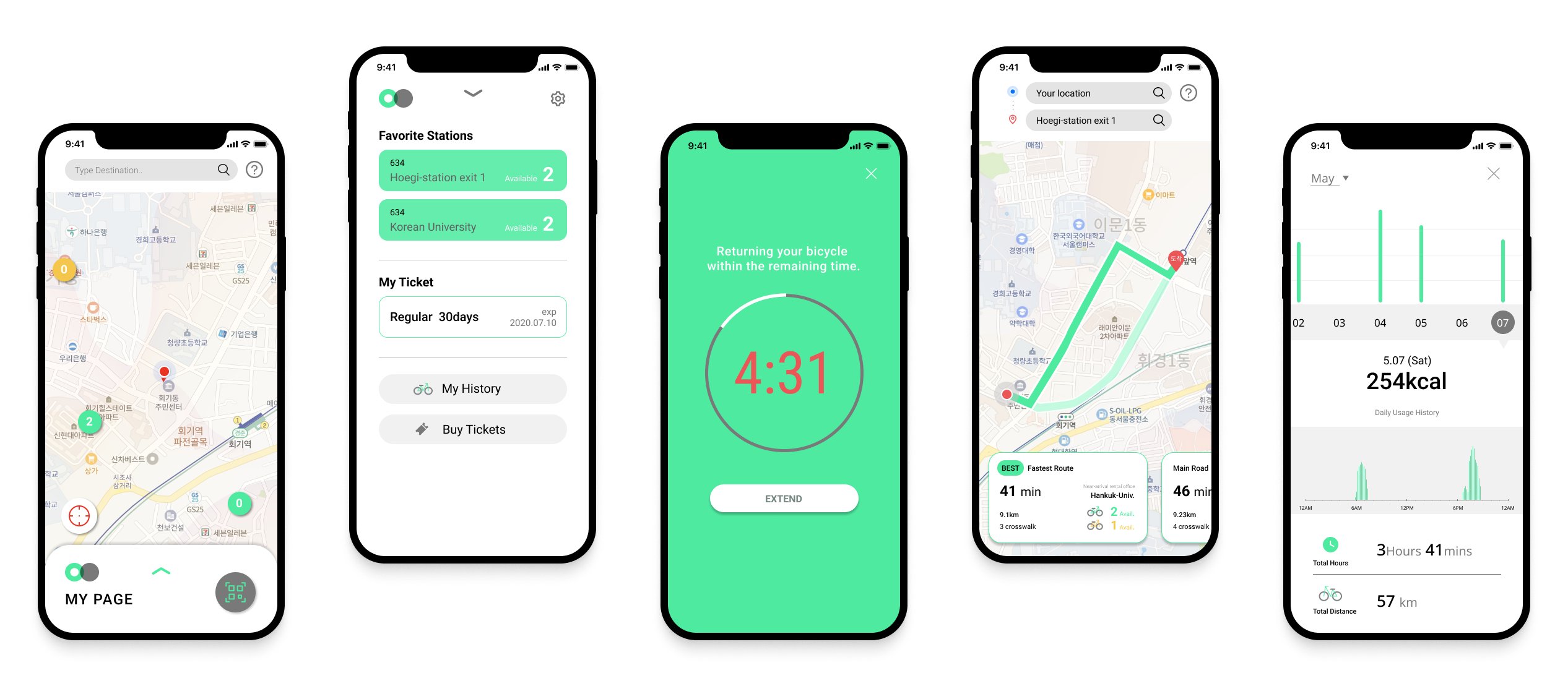
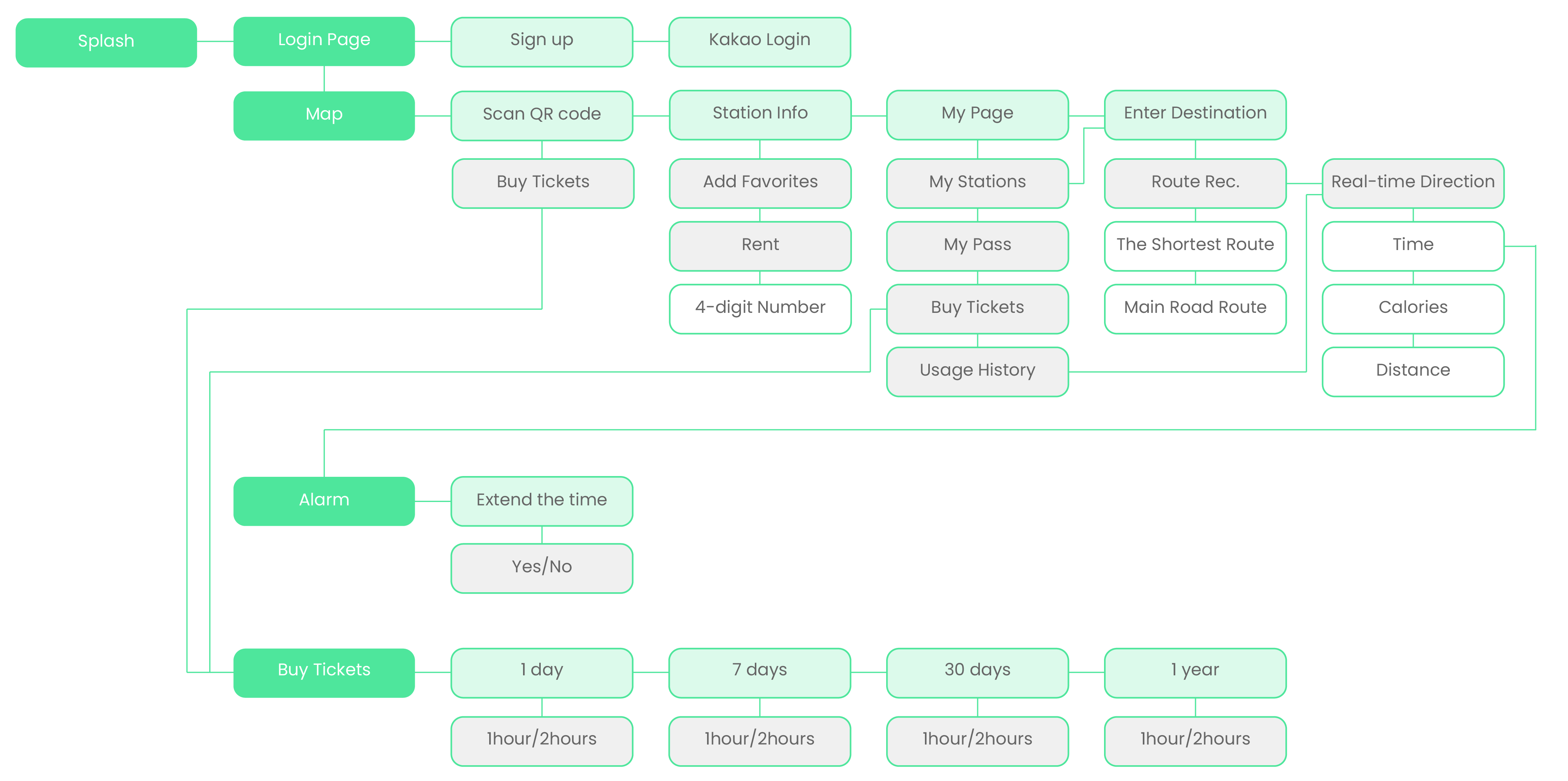
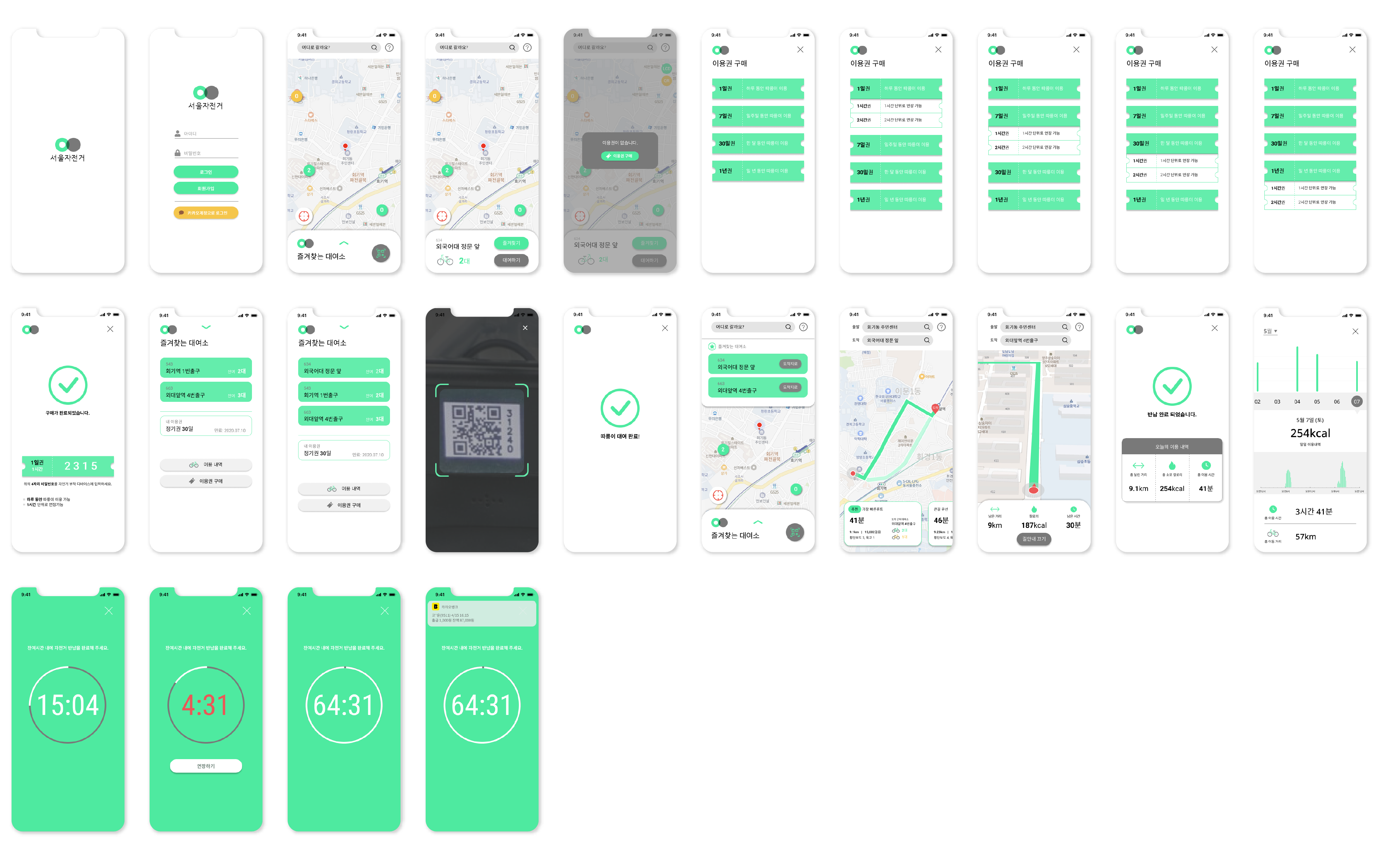
The information architecture of the service is consists of a login page, a map, an alarm and buying a ticket. Once the user logs in, the user can see a map to check the current location and the location of the bicycle rental station. The map allows the user to perform a variety of functions, of which clicking Buy Ticket will switch to the screen for the purchase of the ticket. When the rental time approaches, it automatically switches to the alarm screen.
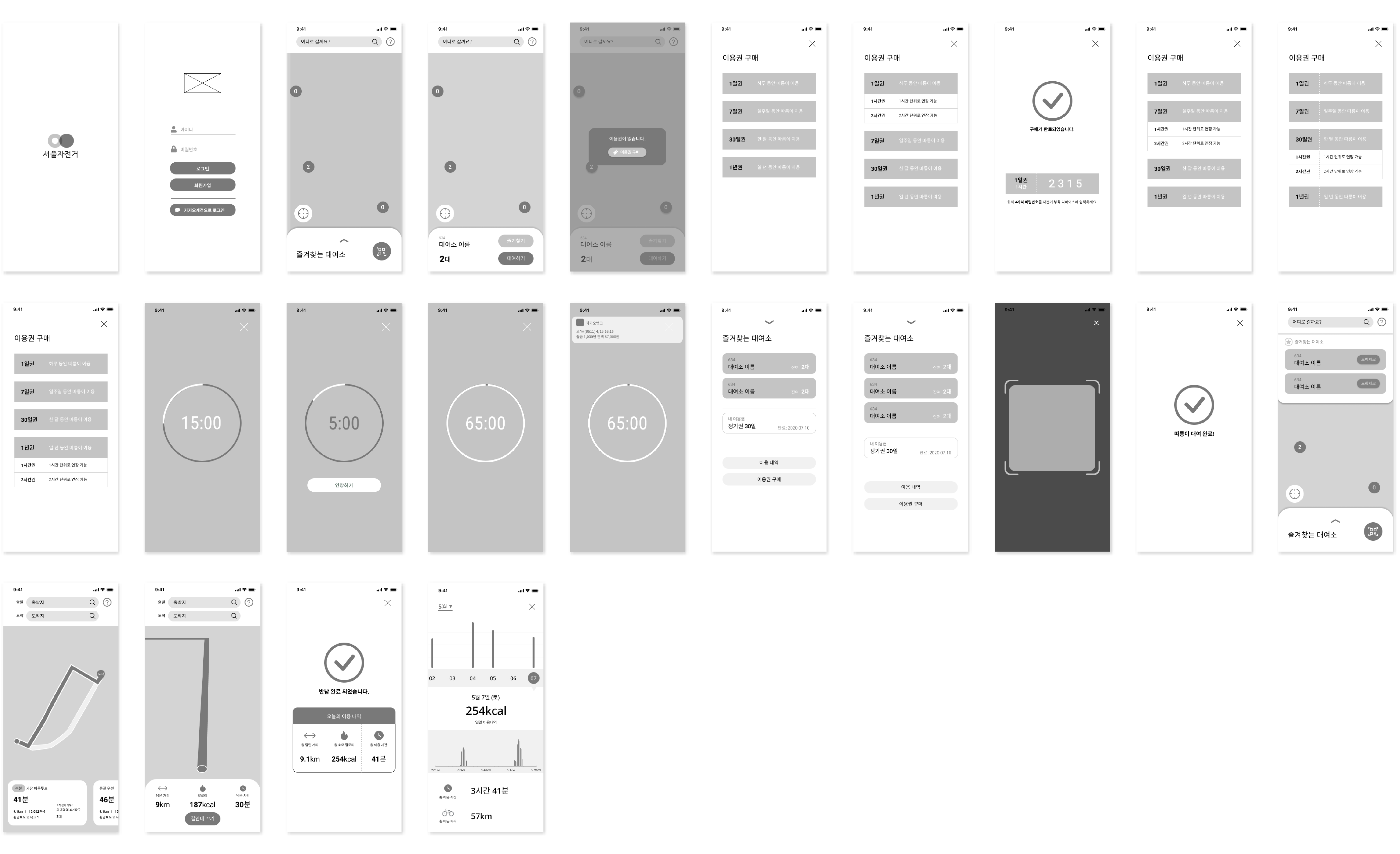
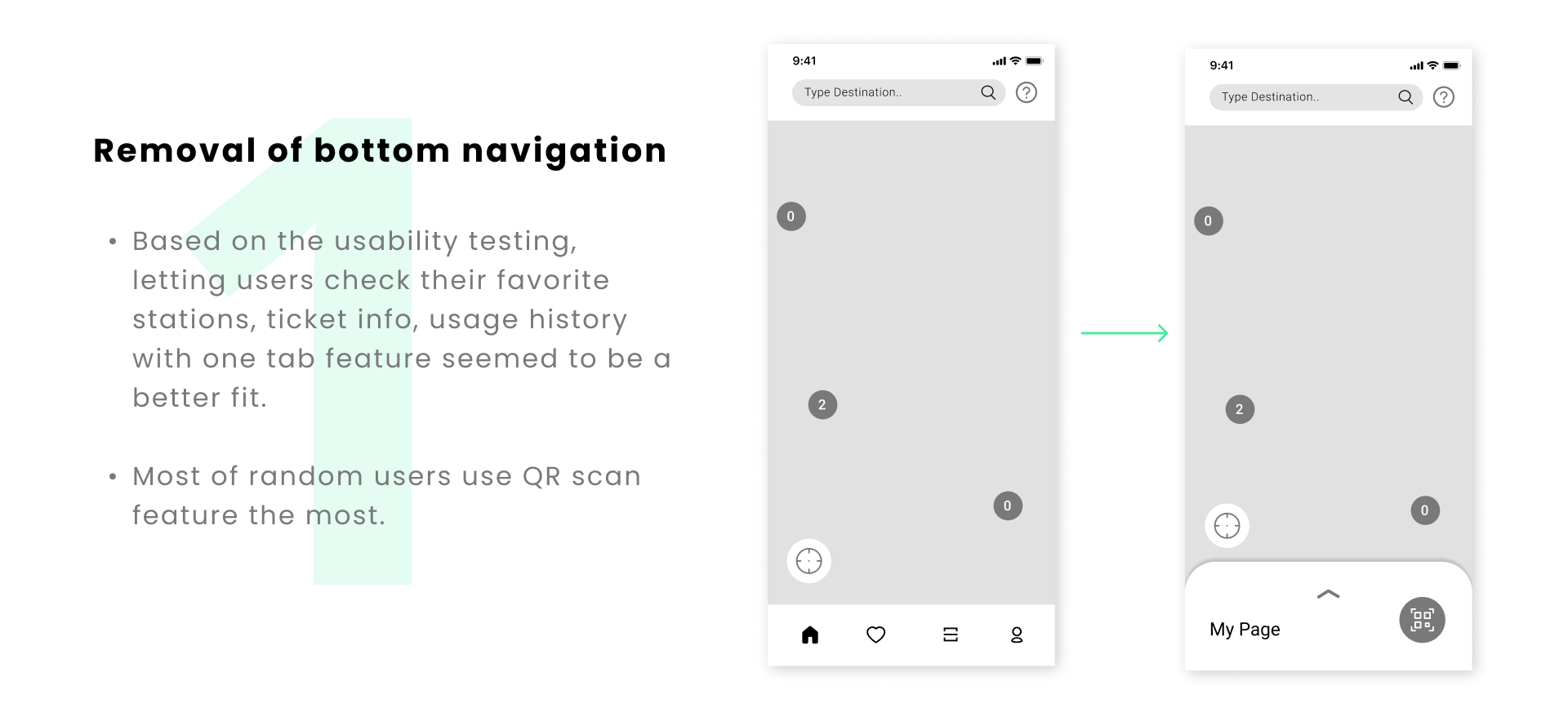
With this initial low-fi wireframes and prototype, I conducted small usability test with three users and I got several feedbacks for updating.
1
- Check the available bikes easily and manage the statations.
2
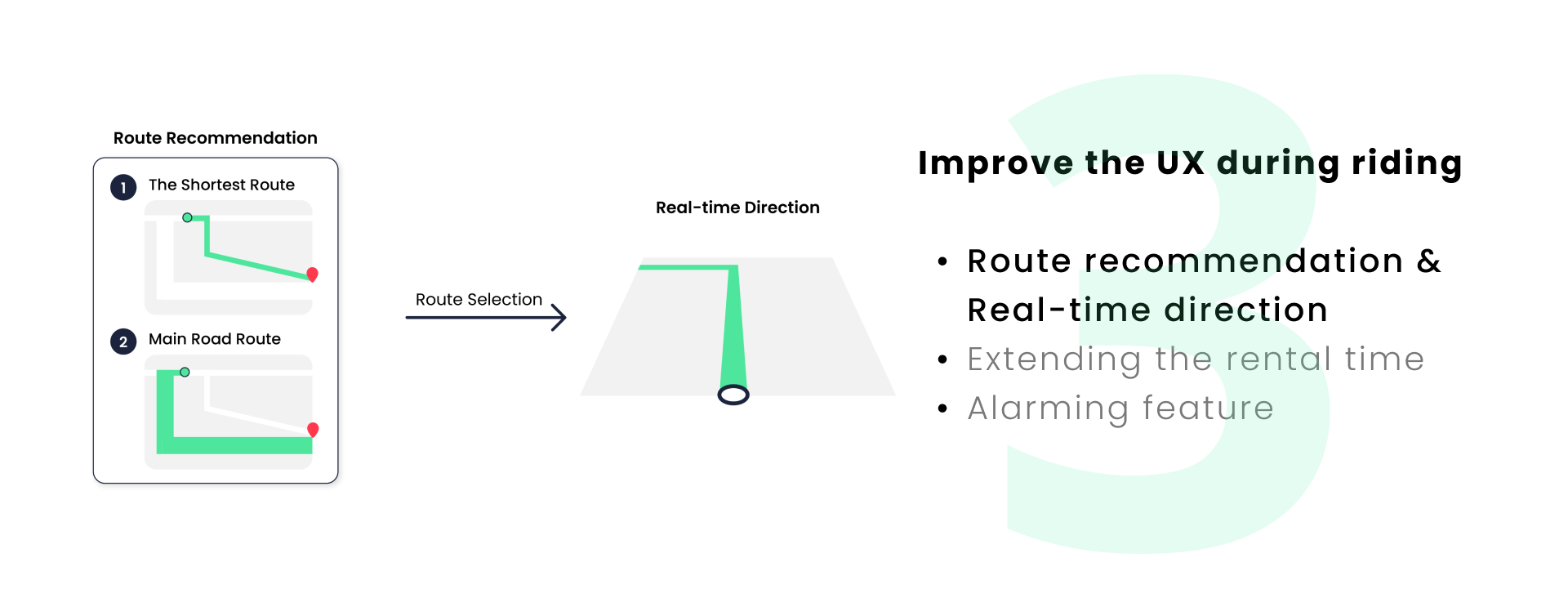
- Providing the real-time map
- Route recommendation and direction guide
- Easily navigate between the map and the main page
3
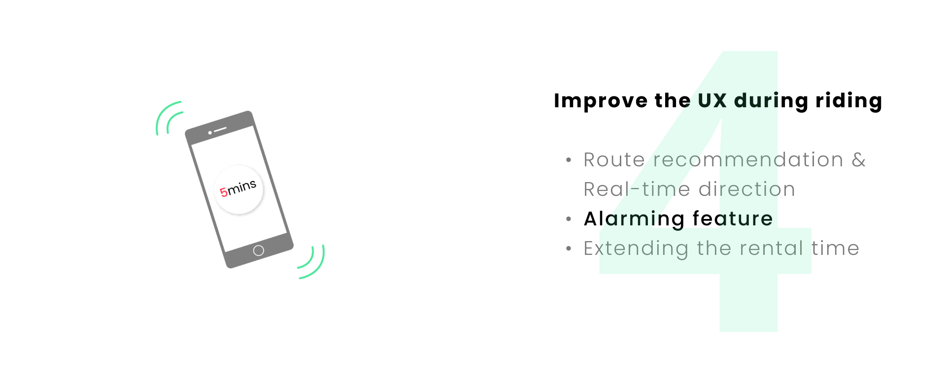
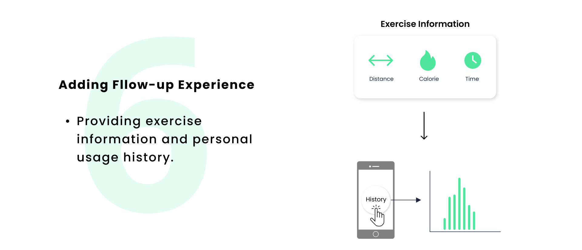
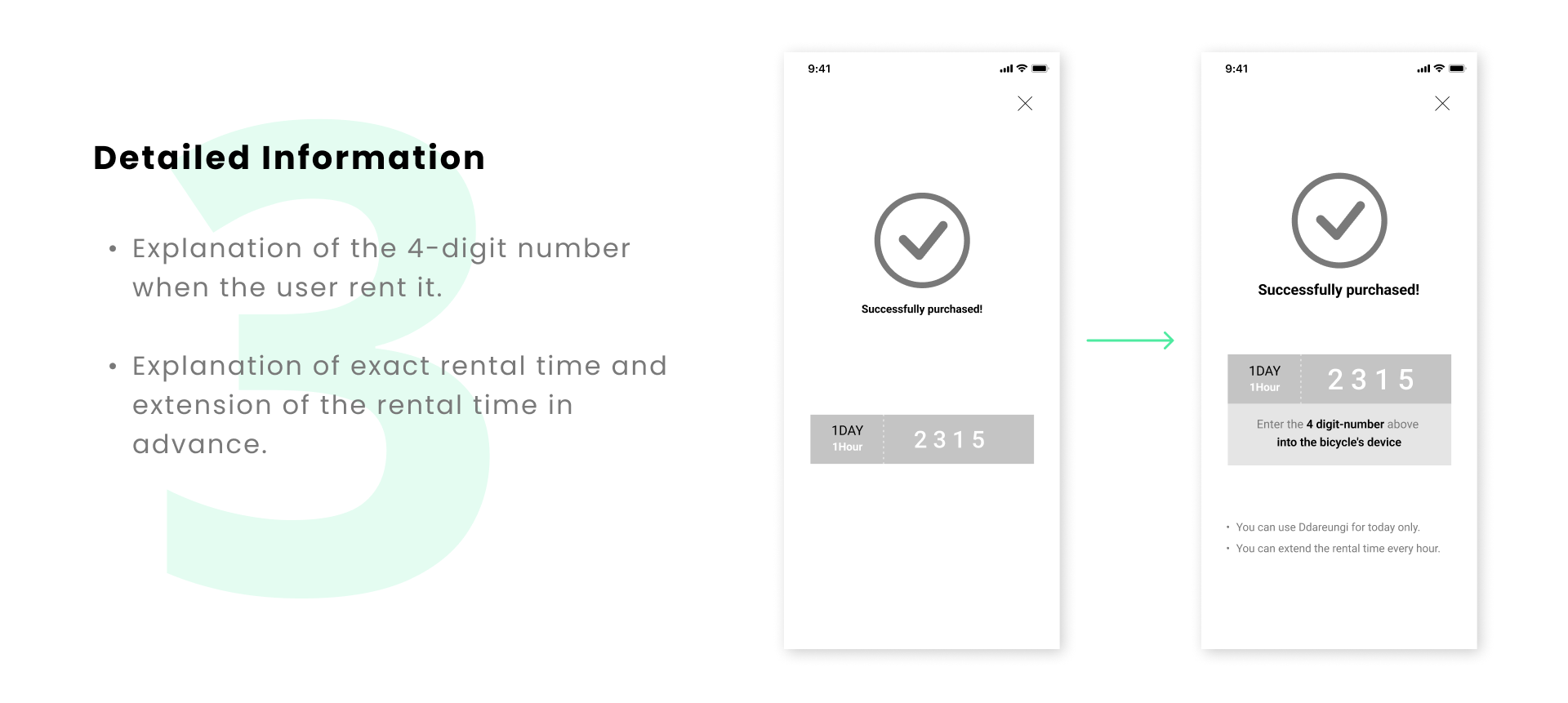
- Receive an in-app alarm 5 minutes before the return time.
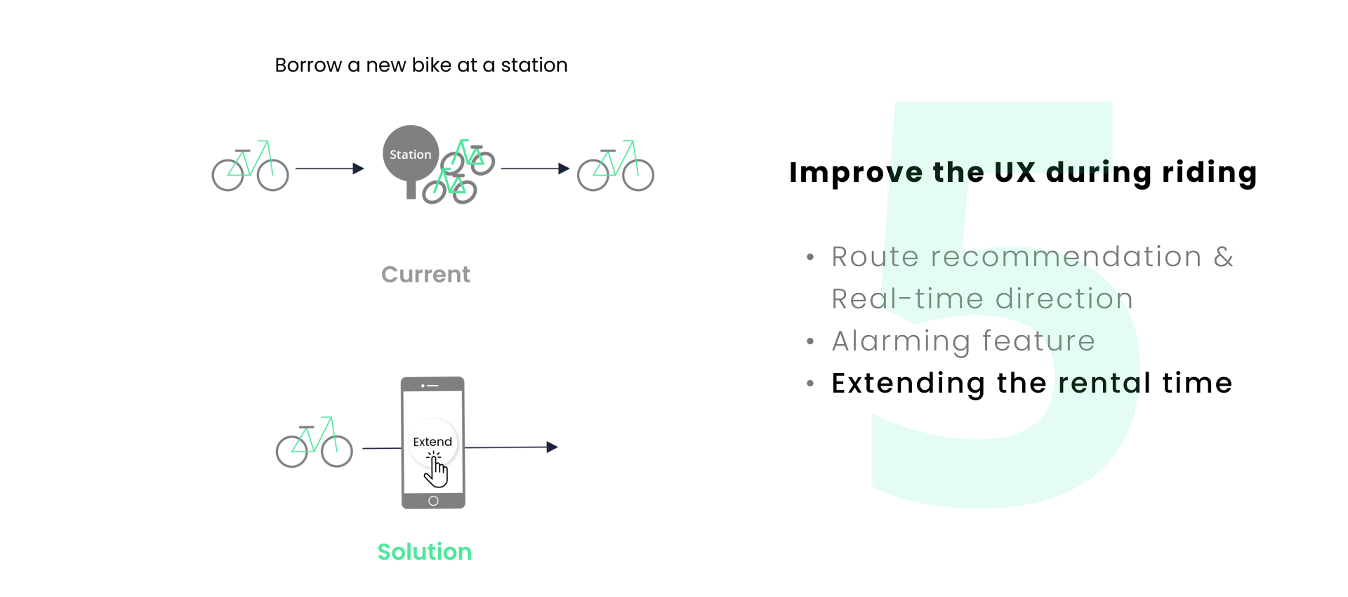
- Extend the rental time directly from the app.
.png)
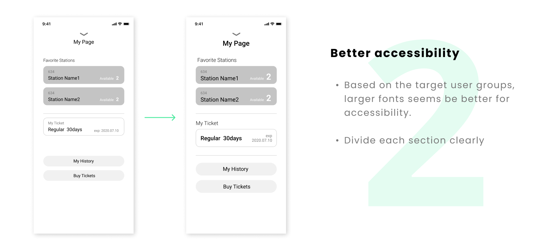
💡 Accessibility
Based on the target users, thought about the accessibility was necessary. Ddareungi is a service used by various age groups from teenagers to 60s. Small fonts and numbers are hard to read for some elders, so the consideration on the size of the fonts and clear guidelines were needed.
💡 Usability Testing
From the usability testing, I could make major Improvements for the design. Usability testing brought me a lot of insights that I didn't think about. I could learn that usability testing is a necessary step for delivering the final solution. If I had more time, I would definitely conduct more usability testing with various user goups.
